
Data, as they say, is king. But data, in its raw form with lines of numbers, can be challenging for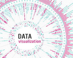 readers to absorb and process, especially if you want them to discern key themes or trends.
The human mind processes information in various ways. Writers and communicators can produce reams of copy but, depending on what is being communicated, this approach is not a welcoming or interesting presentation. By itself, copy and numbers are not visually appealing, they don’t draw us in or encourage retention. Most of us, however, are receptive to visual information, that’s just how our minds work best. That is particularly true when dealing with data.
The best way to drive home a point that includes data is with data visualization.
What is Data Visualization?
Quite simply, data visualization is a means of imparting information and bringing data to life through visual treatments. Visual information is more easily absorbed and understood more quickly. It entices readers with entry points into a story or a report, injects color into presentations and other works, and provides visual texture to any narrative form. Its goal is to communicate information clearly and effectively.
What Are the Types of Data Visualization?
We can make data visual and dynamic in several ways. Here are some options.
Infographics include imagery, charts, and minimal text that provide information in a graphical, visual manner. Infographics can explain data, but done properly, they can also illustrate concepts, themes, or overarching messages.
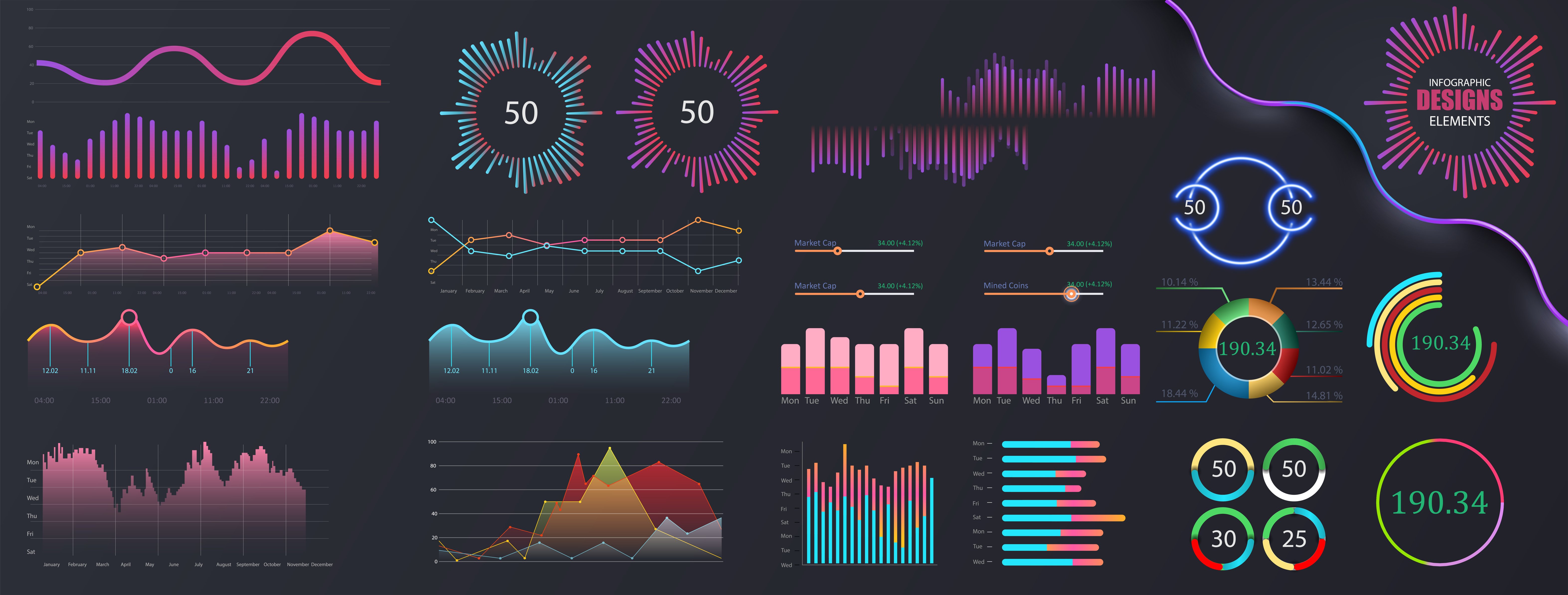
Charts come in a few common forms: bar, line, pie, etc. These are graphical representations of data. There are subtle differences between them, however. A bar chart shines if you’re trying to show similar information over several years, such as annual corporate revenues, for example. Line graphs can handle more inputs, if, say, you want to compare revenue growth for three companies over a selected time frame. A pie chart is more ideal for illustrating parts of a whole, such as showing how revenues from a single year break down by company division.
Diagrams can be a broad area that encompasses many approaches. It includes flowcharts to show progressions or steps in processes, tree diagrams for family or corporate histories, or wireframes to illustrate information structures.
Maps can illustrate population density with varying shades of color to show population numbers or other statistics in different regions. They are useful for more than pinpointing geographic locations.
Best Uses of Data Visualization
More than anything, data visualization makes absorbing information easier and more effective. Our brains absorb and retain information when it features color, texture, images, and interesting font treatments. Visual treatments simply supply more ways to engage our neuropathways.
Data visualizations make great entry points into reports and stories. An entry point is a visual treatment that draws readers into a story. Five pages of black type are hardly appealing, but five pages with diagrams or charts that illustrate the highlights of the article will pique reader interest more effectively.
Trends and themes become much easier to comprehend when you present data visually. Contrast a long line of numbers to analyze the rising cost of real estate, for example, with a colorful chart that makes the trend jump off a page or instantly identifies which neighborhood is priciest.
 A good infographic can bring clarity to an issue. Say you’re discussing spending trends for the coming year. You can list items, but the story will pack a bigger punch if you use icons or other imagery to illustrate the data for each trend and leverage fonts and color to provide hierarchy for the information.
Visual treatments are effective strategies for zeroing in on a key takeaway from a report, a story, or a blog, especially if you have crucial data to communicate. Say you’re comparing the performance of various software systems as determined by a reader poll. Instead of paragraphs, a colorful chart could instantly highlight the best feature of each system under discussion.
Designers can make abstractions more accessible. They can make a complex scientific process much clearer to readers by adding illustrations. The same approach can be used if a complex issue can be broken into segments and presented in small, digestible pieces of information.
Visuals are more evocative than raw copy or numbers if you’re communicating to elicit an emotional response to a sensitive issue. Designers can depict the devastation of rain forests, for example, with effective colors, fonts, and key data points that will generate the response you’re after much more effectively.
Best Practices for Data Visualization
Bringing data to life relies on creative thinking about effective communications as much as it does about graphic skills. Here are some thoughts to keep in mind.
- Great data visualizations starts with refining your thinking. When presented with data or concepts, always ask yourself, “How can I show this visually?”
- Organize data by category or themes and use each visualization segment to present easy-to-understand chunks
- Arrange data in such a way that patterns or trends emerge quickly. Color is a great strategy for drawing attention to key data points
- Use color, design styles or other visual elements to appeal to emotions or encourage the outcome you want from readers
- Use visual clues, symbols, font treatment, or colors to highlight key figures and create a hierarchy of information
- Never sacrifice accuracy and function for visual impact
- Make sure your designs are clear and free of clutter
- Think about combining various types of visualizers to create more dynamic presentations
- Keep readability in mind and make sure that readers can grasp what you’re trying to convey at a glance
We are increasingly becoming a more deeply visual society. Yet the issues we read about and must assess are becoming more complex and broad ranging. Our attention spans are getting shorter because so many things clamor for our time and mental energy. And, of course, data is being generated and disseminated at lightning speeds.
In this environment, communicators, marketers, and designers must use effective strategies that cut through the clutter and get their messages noticed. Well executed, smart, and easily digestible visual communication, especially when explaining dense or complicated topics, is a crucial strategy to get that share of eyeballs.
You can find more tips and applications to help your business grow by visiting the G&A Library.