Data, as they say, is king. But data, in its raw form with lines of numbers, can be challenging for readers to absorb and process, especially if you want them to discern key themes or trends.
The human mind processes information in various ways. Writers and communicators can produce reams of copy but, depending on what is being communicated, this approach is not a welcoming or interesting presentation. By itself, copy and numbers are not visually appealing, they don’t draw us in or encourage retention. Most of us, however, are receptive to visual information, that’s just how our minds work best. That is particularly true when dealing with data.
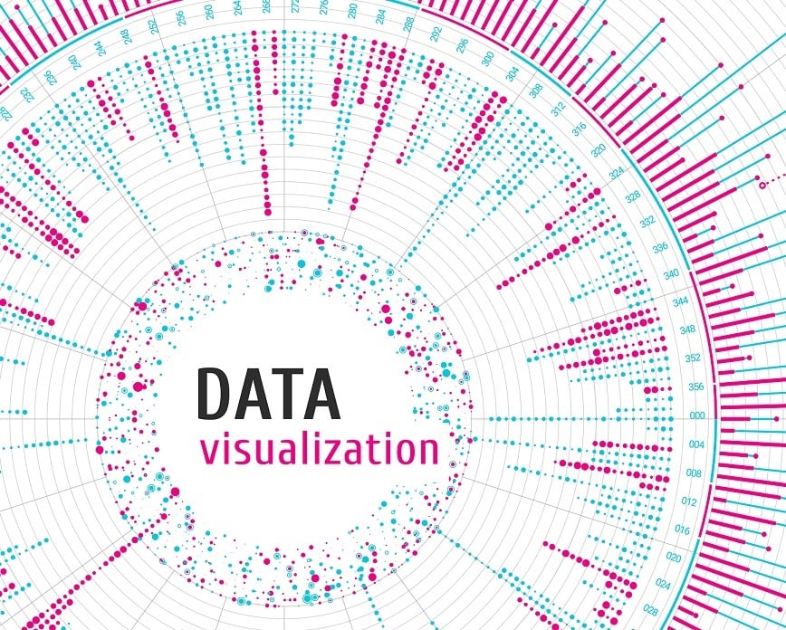
The best way to drive home a point that includes data is with data visualization.