The story of color is changing. An overenthusiastic use of loud, bright hues in recent years has, ironically, dulled their impact. Perhaps we’re all yearning for more mellow, calming
experiences, or perhaps we simply want a visual change. Whatever the actual reasons, design trends are shifting to a more muted, less vibrant color palette.
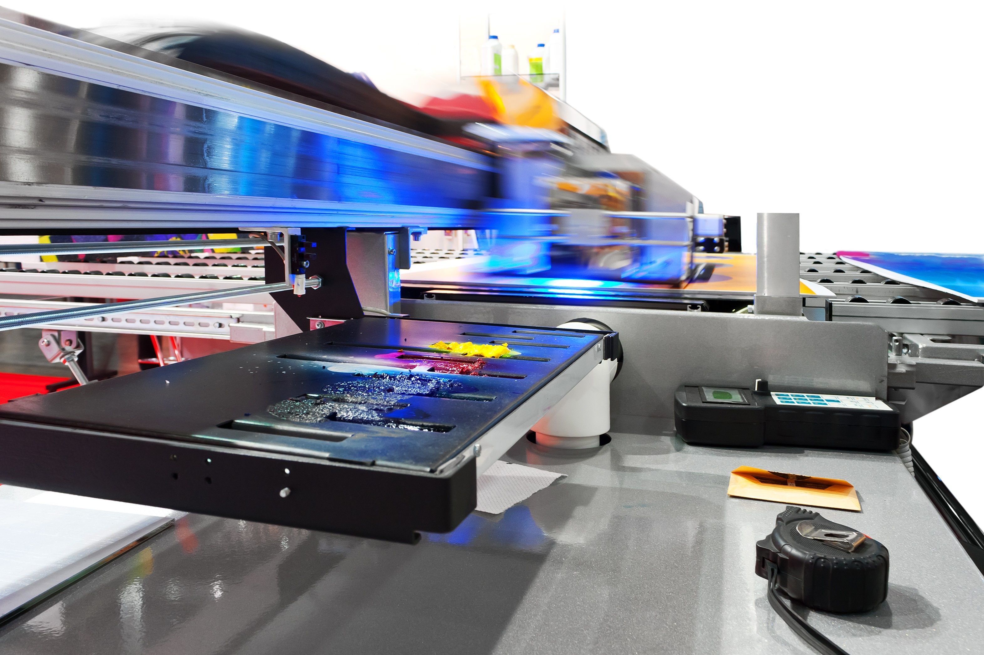
With that in mind, let’s consider how the printing process can affect color choices and see how to use color cost-effectively without reducing its visual appeal. Besides the amount of ink needed to print a brochure or a wine label, crucial elements such as the number of colors, and the paper or other substrates on which the images are printed, have a great effect.


