
The story of color is changing. An overenthusiastic use of loud, bright hues in recent years has, ironically, dulled their impact. Perhaps we’re all yearning for more mellow, calming

experiences, or perhaps we simply want a visual change. Whatever the actual reasons, design trends are shifting to a more muted, less vibrant color palette.
With that in mind, let’s consider how the printing process can affect color choices and see how to use color cost-effectively without reducing its visual appeal. Besides the amount of ink needed to print a brochure or a wine label, crucial elements such as the number of colors, and the paper or other substrates on which the images are printed, have a great effect.
Ink Consumption
It may surprise you to know that ink consumption is usually a small part of total printing costs. In theory, a brochure or a poster with less ink coverage will lower ink usage and therefore reduce ink costs. While that’s strictly true, unless you’re executing long runs, the amount of ink consumed will not impact the price of a print project. Usually, it’s not enough to affect the colors you choose for your job.
Before we go on, let’s discuss the importance of talking to your printer early in the project.
Jobs will run more smoothly when designers share concepts with their printers before submitting files. This is particularly true for complex projects or those with intricate details. Color management can fall into this category, given the choice of printing technology available today. Offset, digital, and inkjet technologies all have their quirks for handling and executing color. Design decisions may hinge on the type of press on which your print provider will run the job. We’re going to focus on offset printing for this discussion.
Spot Colors vs Process Color
To achieve brilliant, vibrant, or fluorescent colors that scream for attention, it’s often necessary to run spot colors, which can significantly add to the cost of a job. Designers sometimes believe they must always use spot colors to produce a specific color, but that’s not true. It may be possible to create the preferred effects more cheaply with process colors.
Presses print with four process colors: cyan, magenta, yellow, and black (CMYK). Printers can create almost all colors by mixing these four inks on the press in varying ratios. Printers create entire books, magazines, and brochures with only CMYK.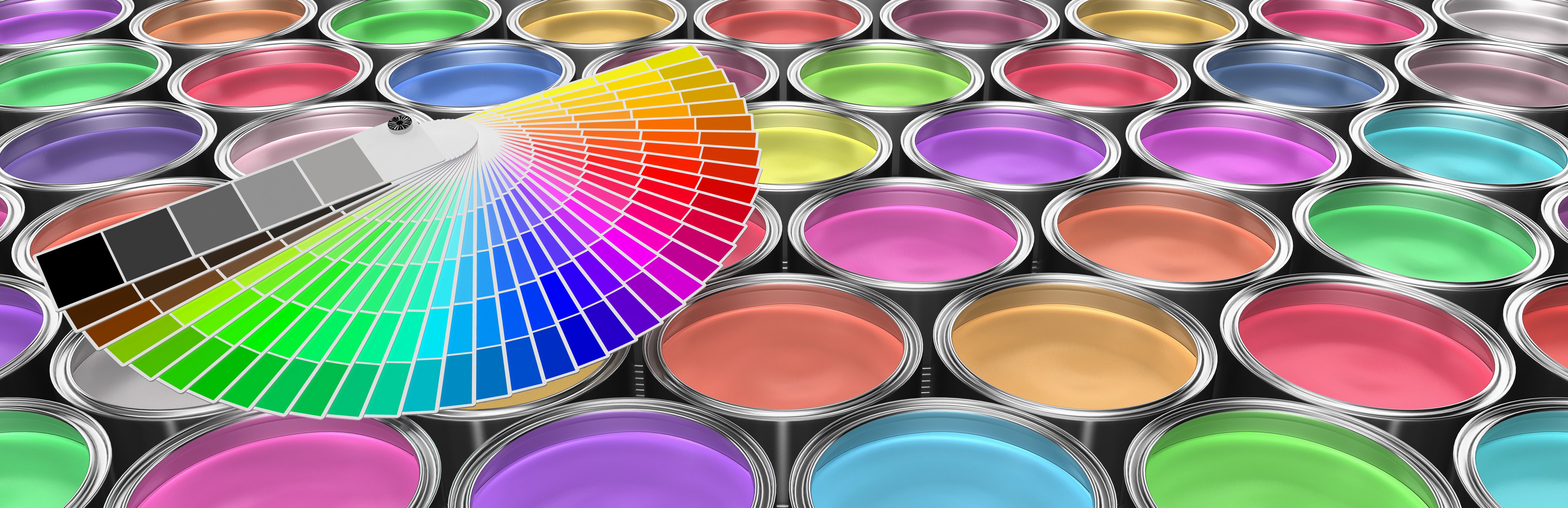
Sometimes, though, a job needs an exact, special color. That’s when you specify a spot color. Spot colors come premixed from the ink manufacturer, based on industry standard color systems like the Pantone Matching System (PMS). A spot color may be necessary when you must adhere to strict brand identity requirements or when very high production values really matter. Printers may use a fifth color for specialty shades, like a fluorescent or neon, they cannot reproduce well with CMYK. Other finishing options, like spot varnishes, specialty inks, or metallic inks can also count as spot colors.
Ink manufacturers charge more for PMS color inks. But more significantly, adding spot colors requires imaging extra printing plates, which means more time and supplies for each spot color.
In offset printing, printers must make a plate for every color, so every job requires at least four printing plates. If you run two spot colors, printers must etch two more plates for the job.
You need plates for every imposition layout, also called a signature. Let’s say you’re producing a 32-page brochure, which the printer will run in four signatures of eight pages each. For CMYK, each signature needs four plates, a total of sixteen to print the job. If you add two spot colors to your project, the printer will charge for making eight more plates.
Costs can escalate in this scenario. If your project doesn’t require eye-popping treatments and loud colors, it’s highly likely you can execute your design vision using the standard four-color process and keep your costs down.
Paper
Paper is, by far, the costliest supply element of any print job. It can have a significant impact on the overall cost of a project or the way you design a project to produce desired colors.
Paper grades absorb ink differently, based on their weight and surface treatment. Fine printing paper will be coated or uncoated. Coated paper has a very smooth matte, glossy, or satin finish, while uncoated paper has a more unfinished texture and duller appearance. Any color, even one you choose from the Pantone book, will look different on each type of paper.
Coated paper reflects more light. This makes colors appear more intense and saturated. Light reflection differs, depending on the coating. Uncoated paper is less reflective, so colors have a more muted appearance.
 Paper also comes in various shades of white, from warm to bluer, cooler, tones, and in different grades of brightness. Brightness is the volume of light reflected off the paper. Paper manufacturers measure brightness on a scale from one to one hundred. High-end papers are in the mid-90s. The brighter the sheet, the more light it reflects, and the brighter the colors will appear.
Uncoated paper is less expensive than coated paper, so if a muted palette is what you’re after, uncoated sheets will achieve the results you want at a lower price point. You may also want to consider the shade of white or choose a different colored paper altogether to keep colors in the desired gamut.
Color itself is compelling and evocative, and pretty wonderful. Color management can be fascinating, but highly complex. With forethought and planning about color, your printer can produce spectacular results at a reasonable cost.